When you send someone a link to Tiny Shops — a customer asking what you use, a partner checking you out — that page is doing work on your behalf. We put it through a full accessibility and design audit and fixed what we found. Every figure below was measured in a browser, before and after.
Text you can actually read#
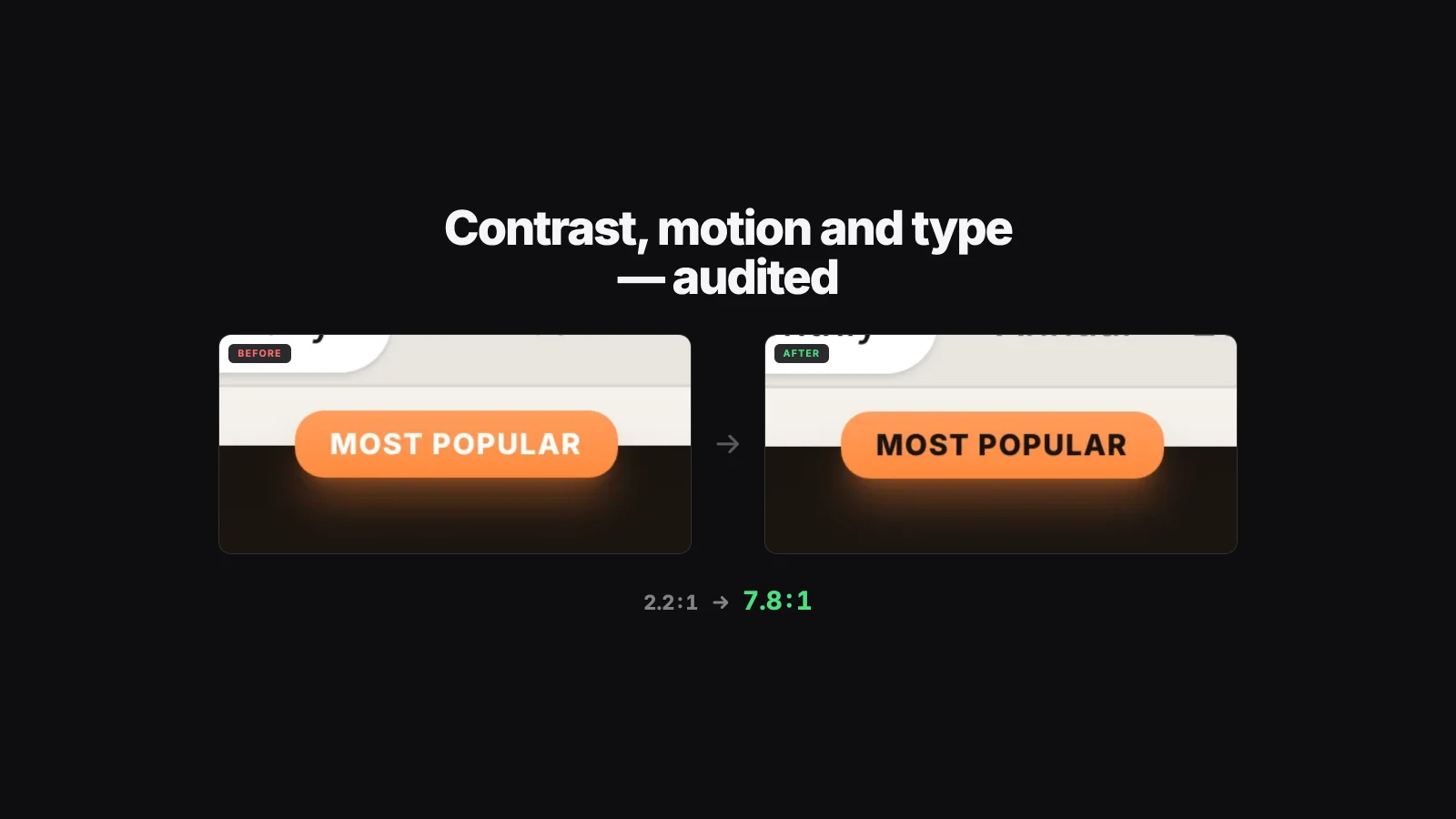
The orange call-to-action buttons had white labels on them. That combination measures 2.2:1 against a background — the accessibility standard for normal text asks for 4.5:1. It affected every conversion button on the site: the main button, the pricing badge, the plan action.
The orange is unchanged. The label is dark now, which measures 7.8:1 on the same colour.
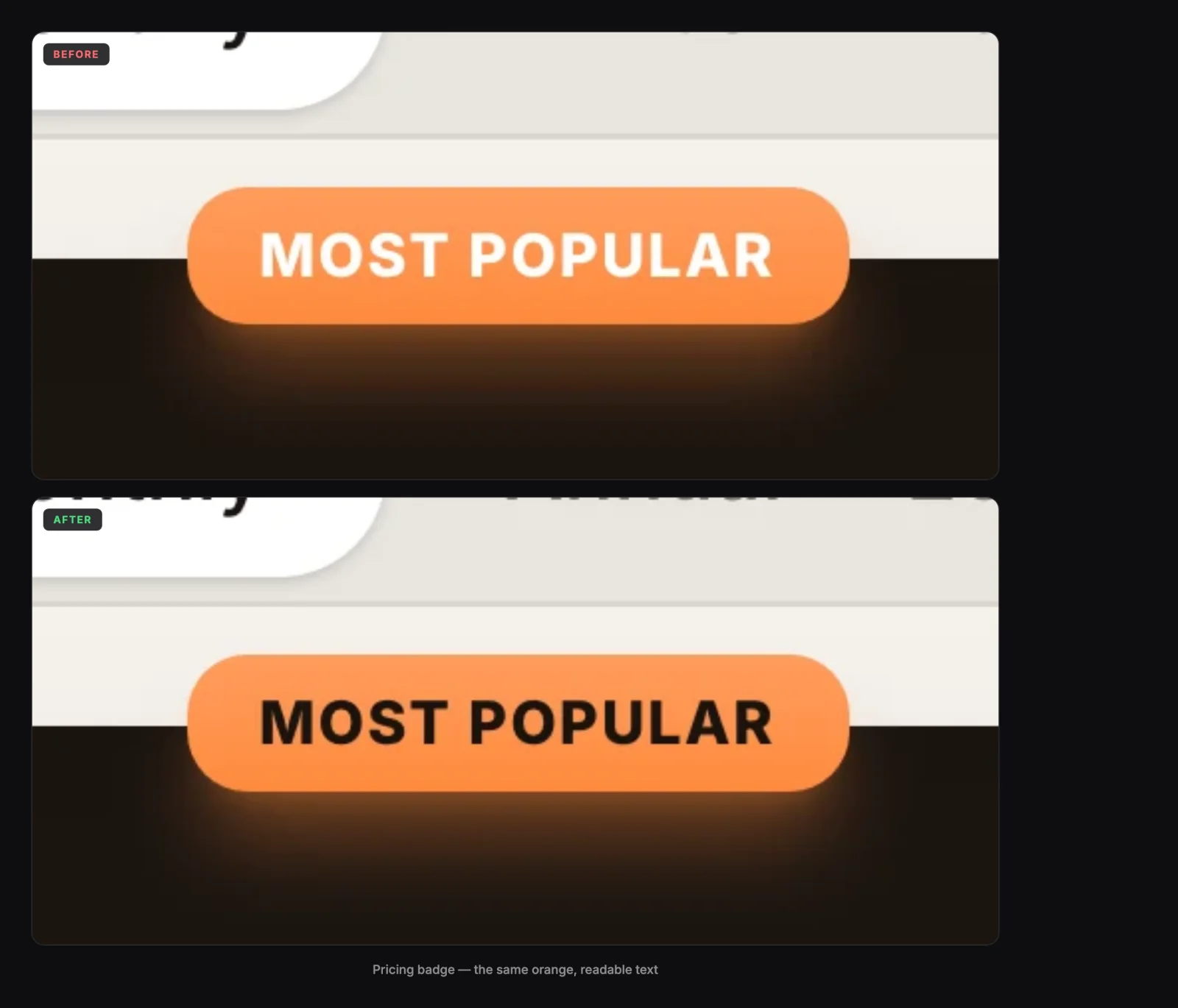
Across the whole site, text that failed the contrast standard went from 65 instances to 10 in the dark theme, and from 119 to 13 in the light one. What remains is decorative — a currency symbol inside an illustration, not anything you need to read.
Legal pages follow your theme#
Privacy, Terms and Contact were built before the rest of the site and never got the theme switch. If you chose light mode and then opened Privacy, you got a dark page.
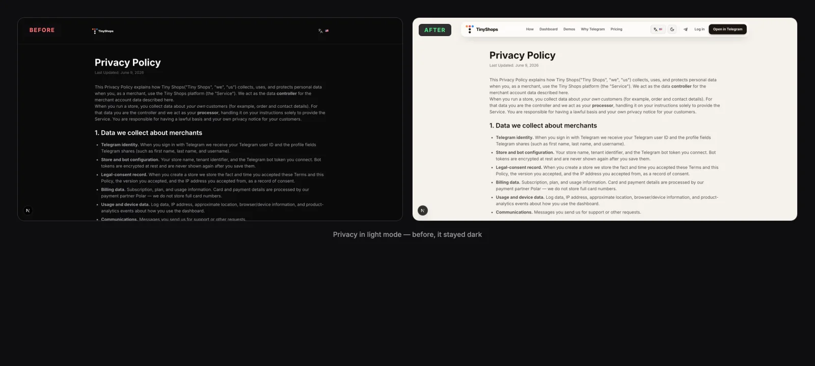
They now use the same colours, navigation and footer as every other page, in whichever theme you picked.
One clear action per demo card#
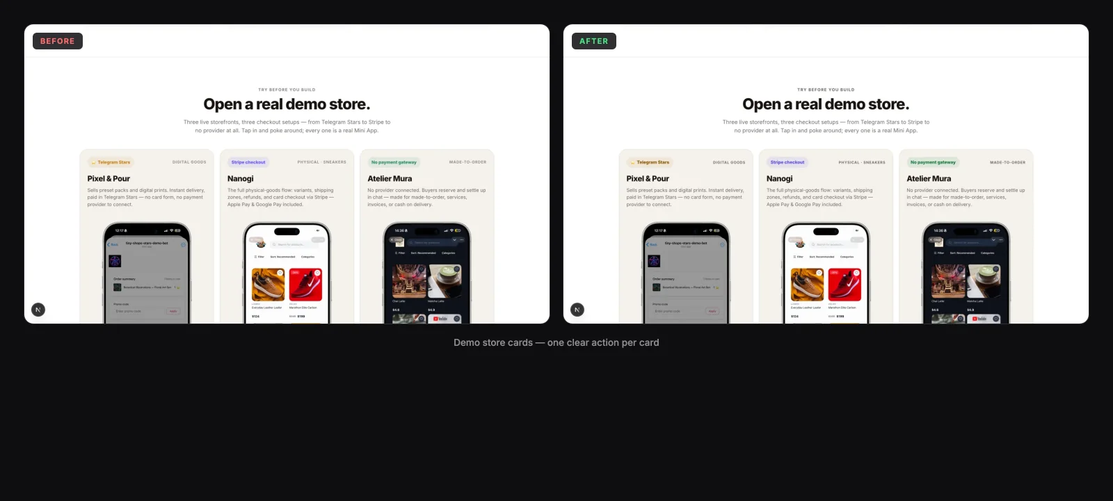
The three demo stores each had a button in a different colour, so nothing indicated which one to try. The payment provider now marks the card; the button is the same on all three.
Smaller things that add up#
- Keyboard navigation shows where you are. Tabbing through the site had no visible focus indicator. Now every button and link has one.
- Screen readers speak Russian on the Russian site. Five controls — the theme switch, the language menu, the mobile menu — announced themselves in English regardless of the language you were reading in.
- Headlines set correctly on phones. Letter spacing was fixed in pixels while the type size scaled, so headings got progressively tighter as the screen narrowed. They now hold the same proportions at every width.
- The page moves when you arrive at a section, instead of running animations continuously in the background. That is easier on a phone battery, and the site loads with roughly a third of the background animation it used to run.
- Touch targets are comfortable. Small icon buttons keep their size but take a larger tap area on touch devices.
Why it needed a pass#
Most of this traced back to a single gap. Our design system named its brand colours in documentation years before they existed as actual code — so each part of the site retyped the colour by hand, and thirty-five of them drifted out of alignment. The same was true of motion: the guidance specified durations but never named the curves, so fourteen animations quietly fell back to the browser default.
Both are now defined once, in one place, with the rules written down. The next change inherits them instead of guessing.
Nothing here requires anything from you, and no store settings changed.
Create or open your store at tiny-shops.com →
- 🇷🇺 Tiny Shops RU
- 🇬🇧 Tiny Shops EN